Photo Retouching
Color Grading
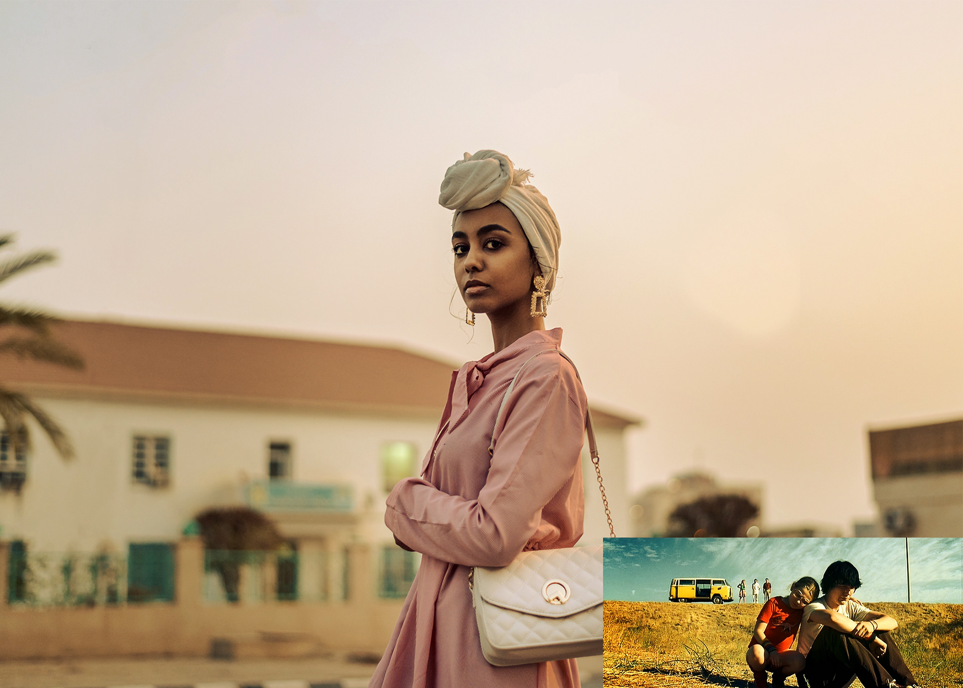
"Little Miss Sunshine"
By increasing yellow and red hues while slightly desaturating other colors, we created an inviting atmosphere. By utilizing a warm, sun-drenched, almost mustard-yellow palette, the film contrasts a bright, hopeful aesthetic with the dark, dysfunctional, and chaotic reality of the characters’ lives.
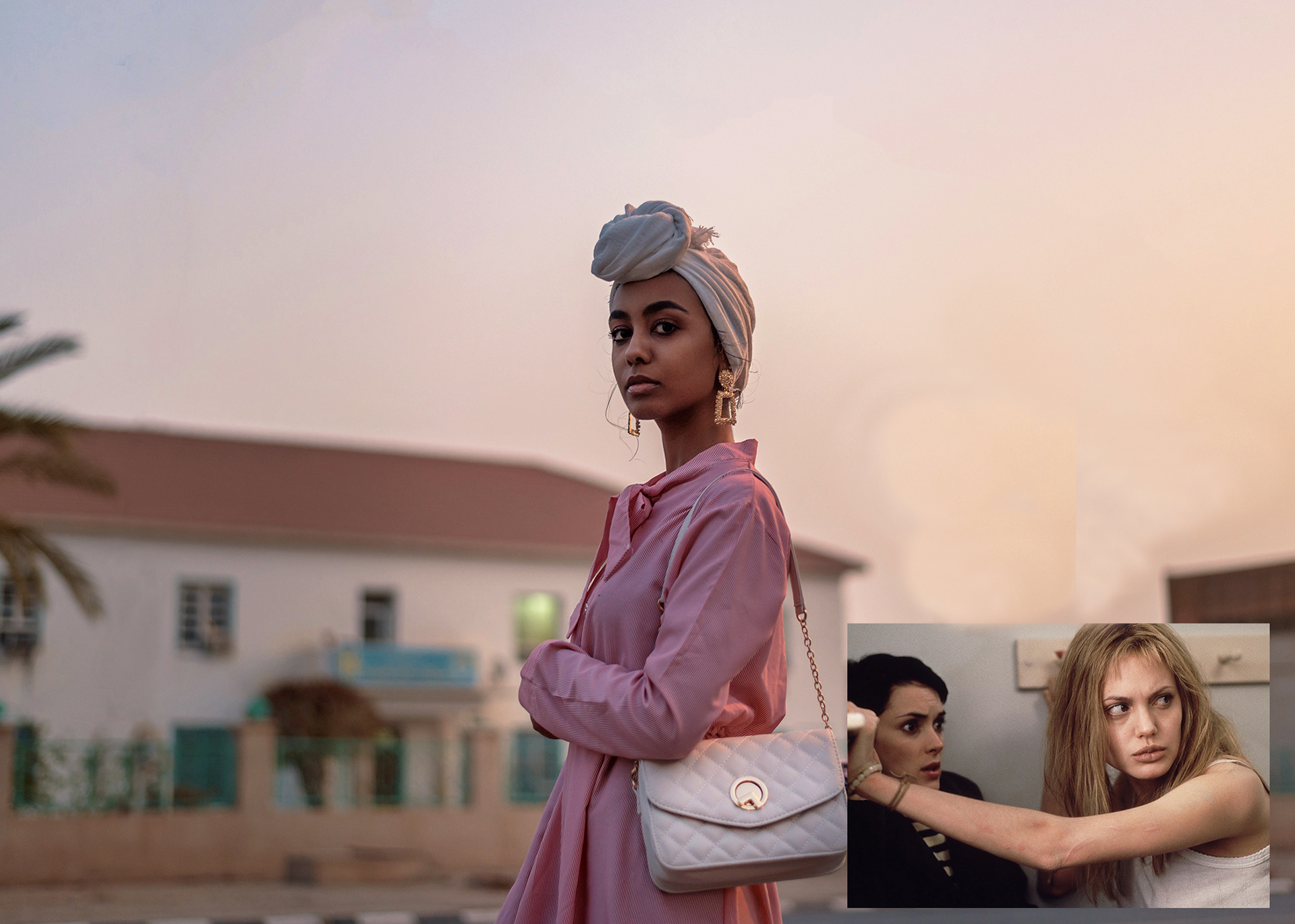
"Girl,Interrupted"
By utilizing a desaturated, cool-toned palette, the film visually represents the trapped, monotonous environment of the 1960s mental institution. The cinematography reflects this world with a specific color palette that includes pastel tones combined with darker shadows. To achieve this, I adjusted saturation levels to soften bright colors, and introduced subtle tints (e.g., warm yellows or cool blues) to enhance mood. I Increased the blacks while reducing highlights to deepen shadows, while using curves adjustment layers for fine-tuning midtones without losing detail.
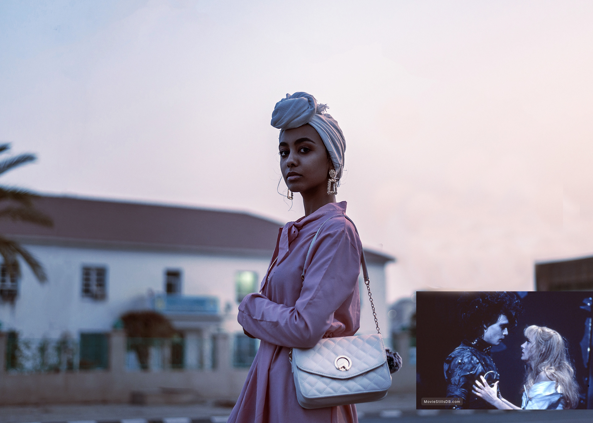
"Edward Scissorhands"
The film employs a combination of pastel colors contrasted with darker shades. To mimic this effect I utilized Adobe Photoshop to adjust hue and saturation levels, also experimenting with split toning to introduce pastel highlights while maintaining darker shadows. Darker tones are strategically placed to add depth and highlight emotional tension. Using desaturation can give images a vintage feel reminiscent of the film’s setting.
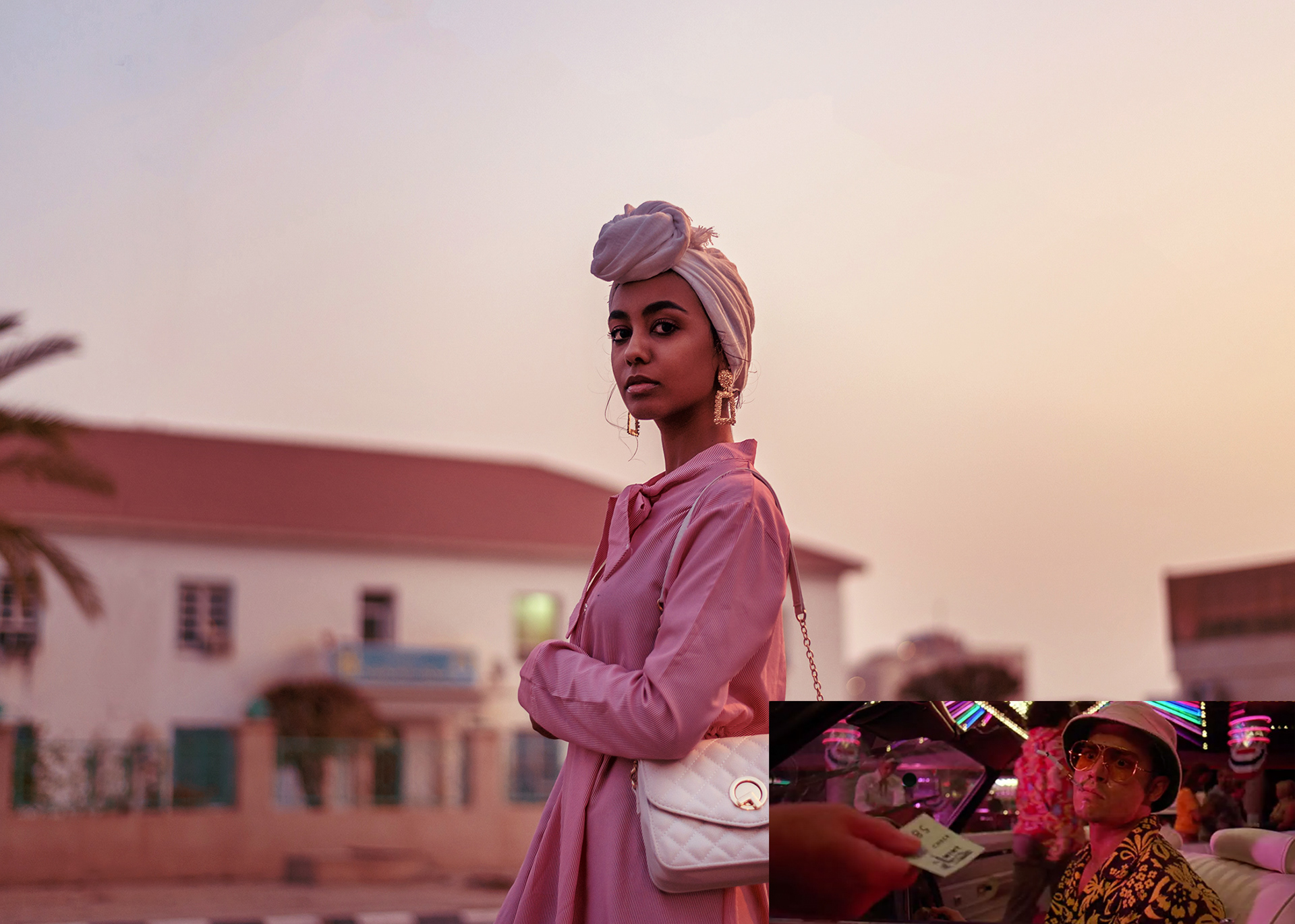
"Fear and Loathing in Las Vegas"
To reflect an emotionally charged look reminiscent of fear,I focused on specific elements such as saturation levels, color contrast, and overall mood.Lowering saturation helps strip away vibrancy from colors, creating a more lifeless feel. Aim for a muted palette where colors appear washed out rather than bright. Deepening shadows created stark contrasts that enhanced the feelings of fear. Darker areas add depth while also instilling uncertainty