The Challenge:
A newly established welding business sought a distinctive logo that encapsulated its core values: loyalty, reliability, and trust. The absence of a strong visual identity posed a challenge in establishing brand recognition and conveying the essence of their services to potential clients.
The Solution:
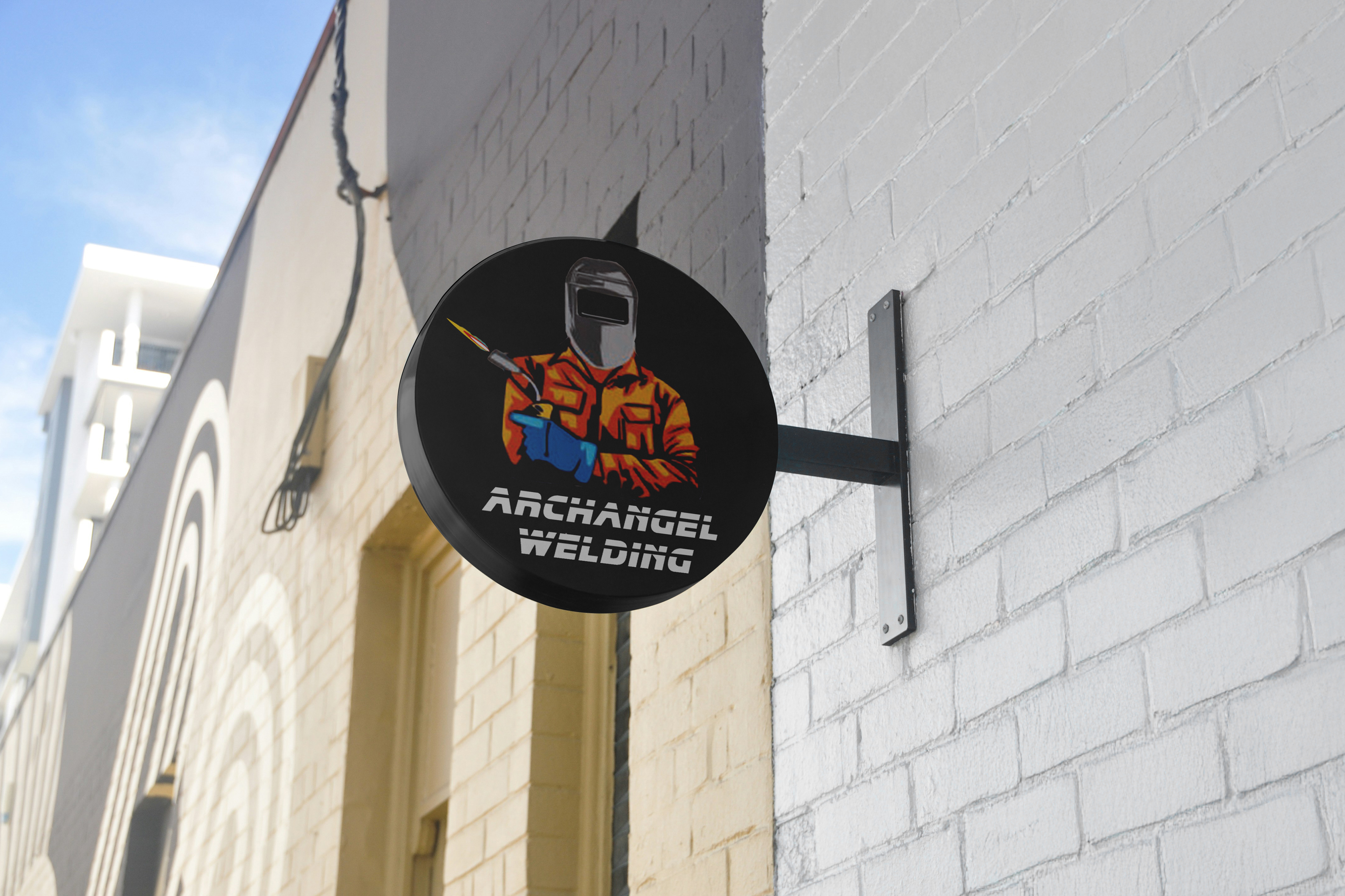
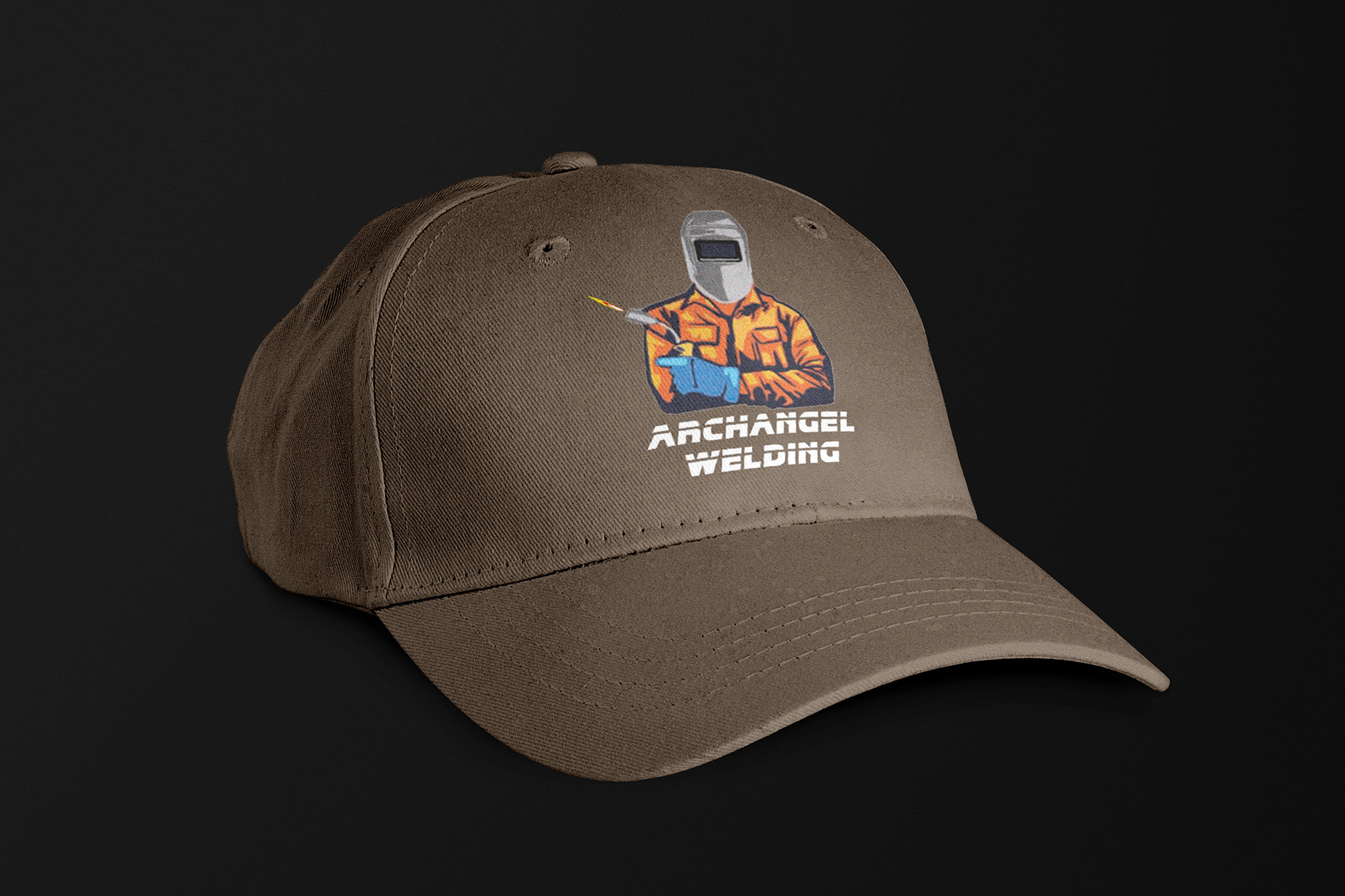
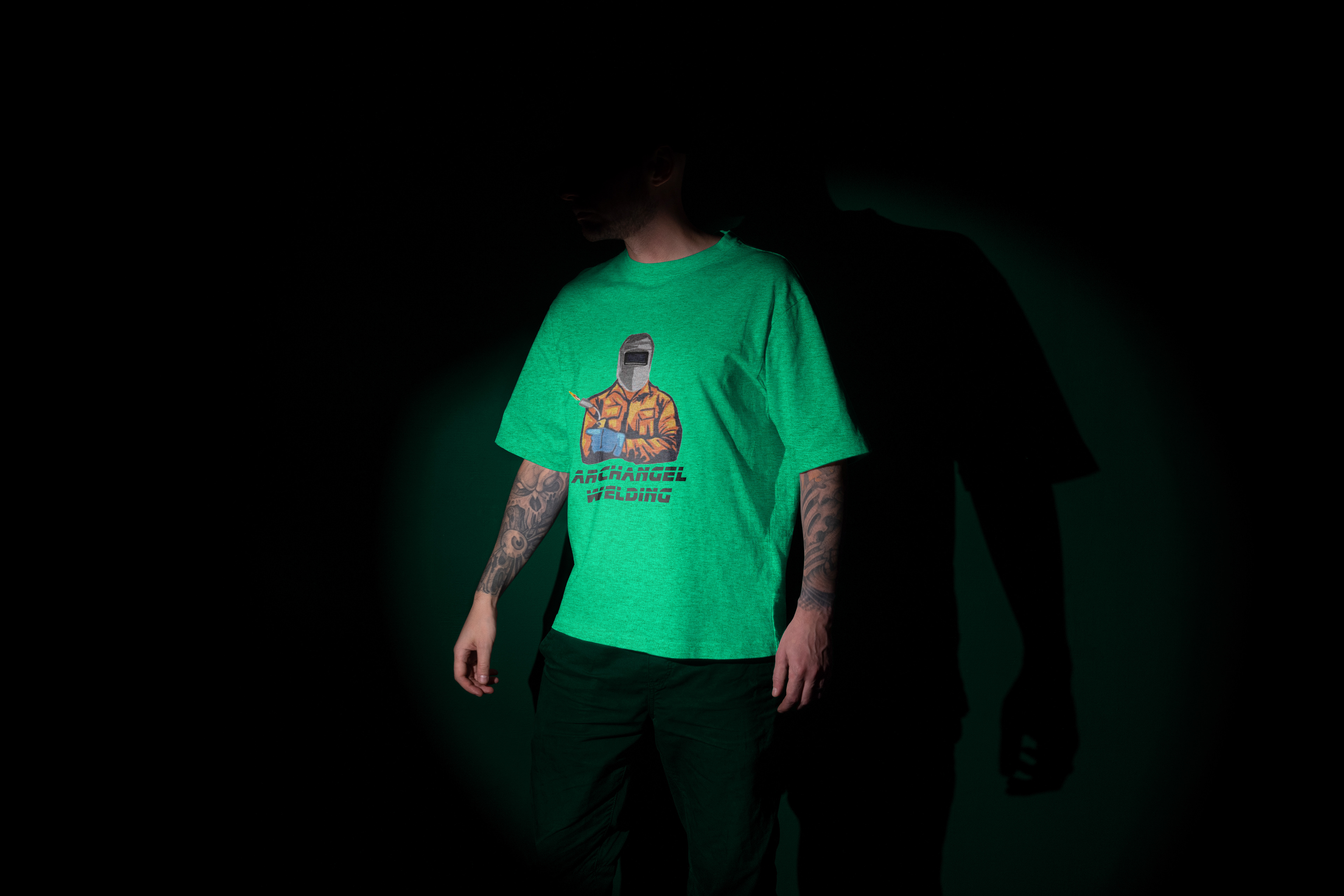
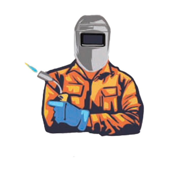
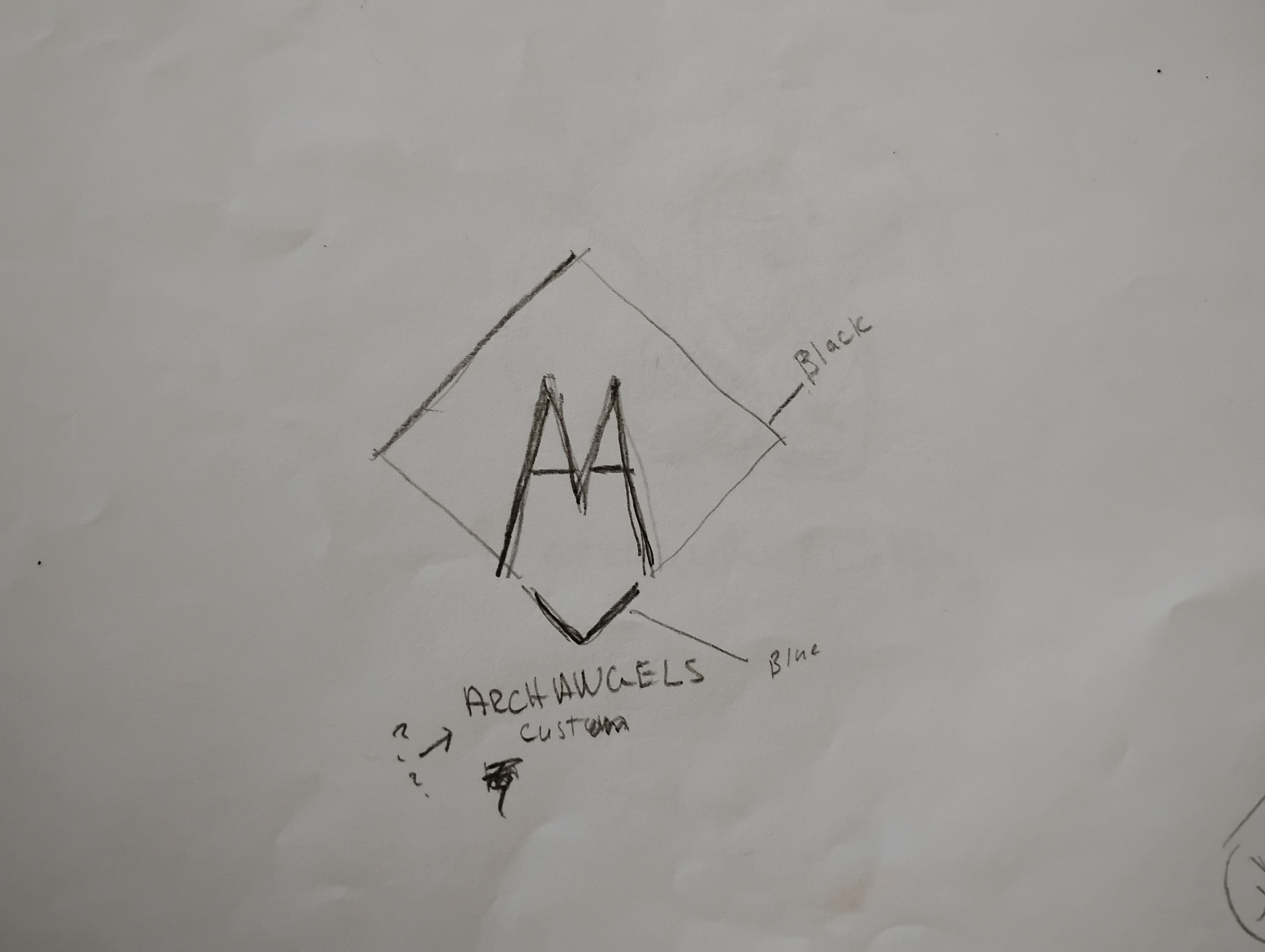
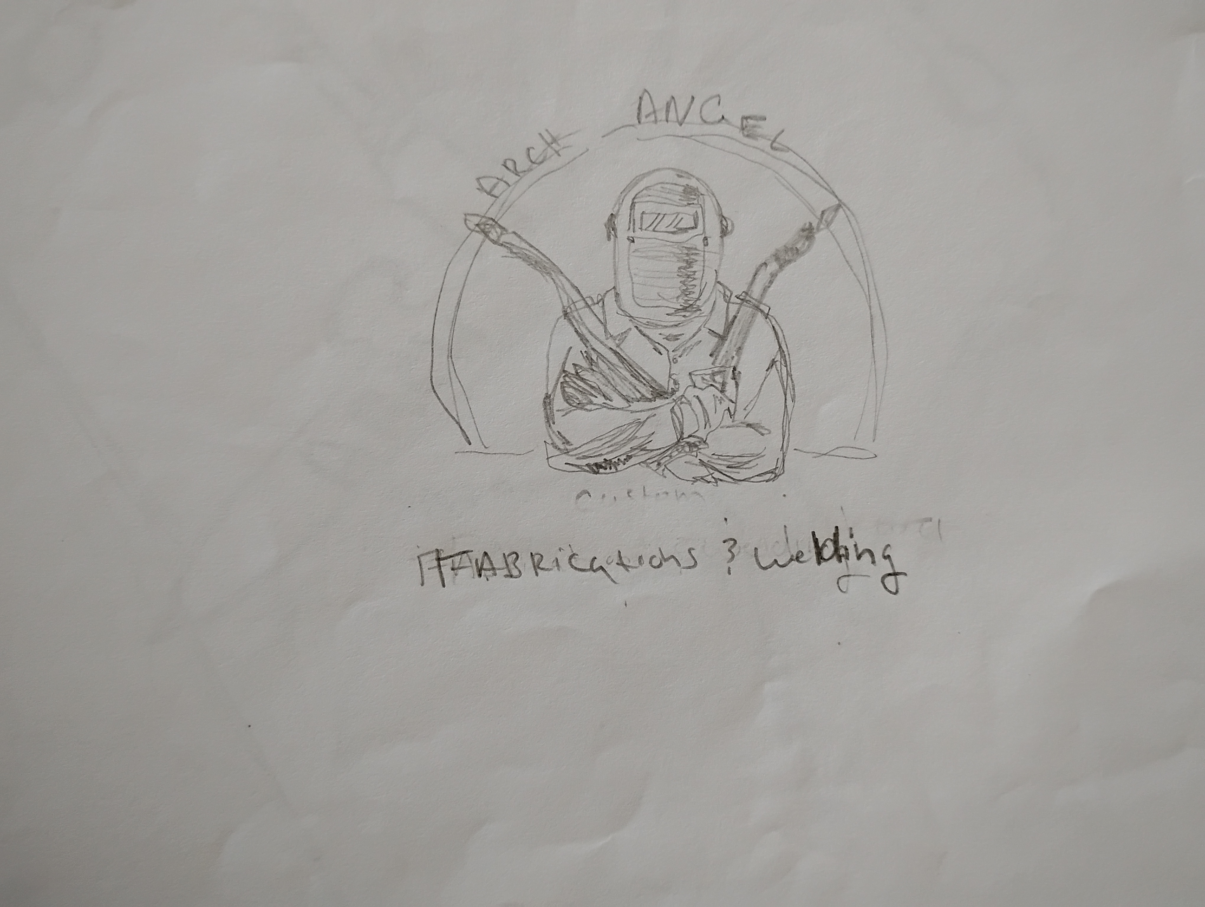
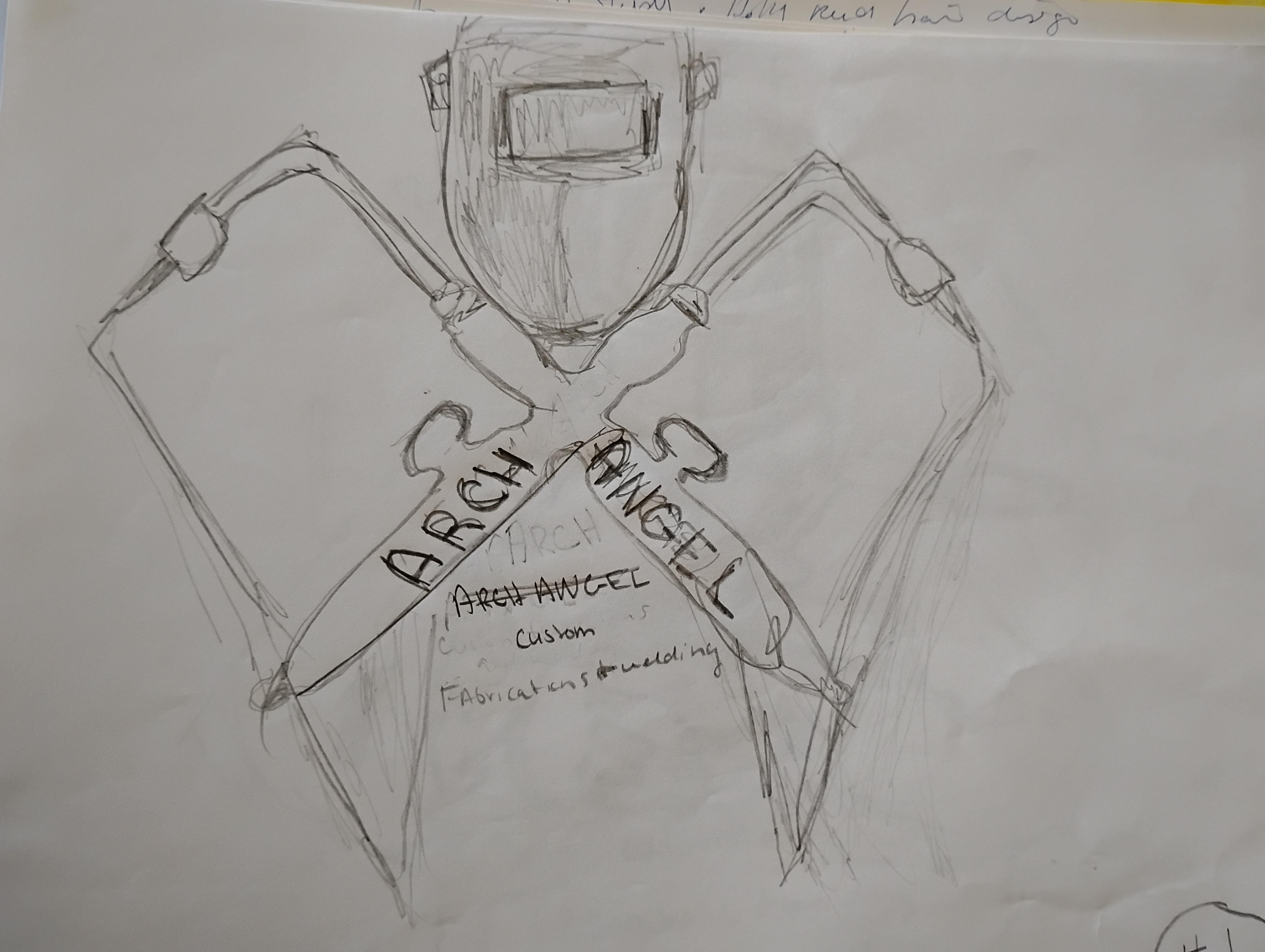
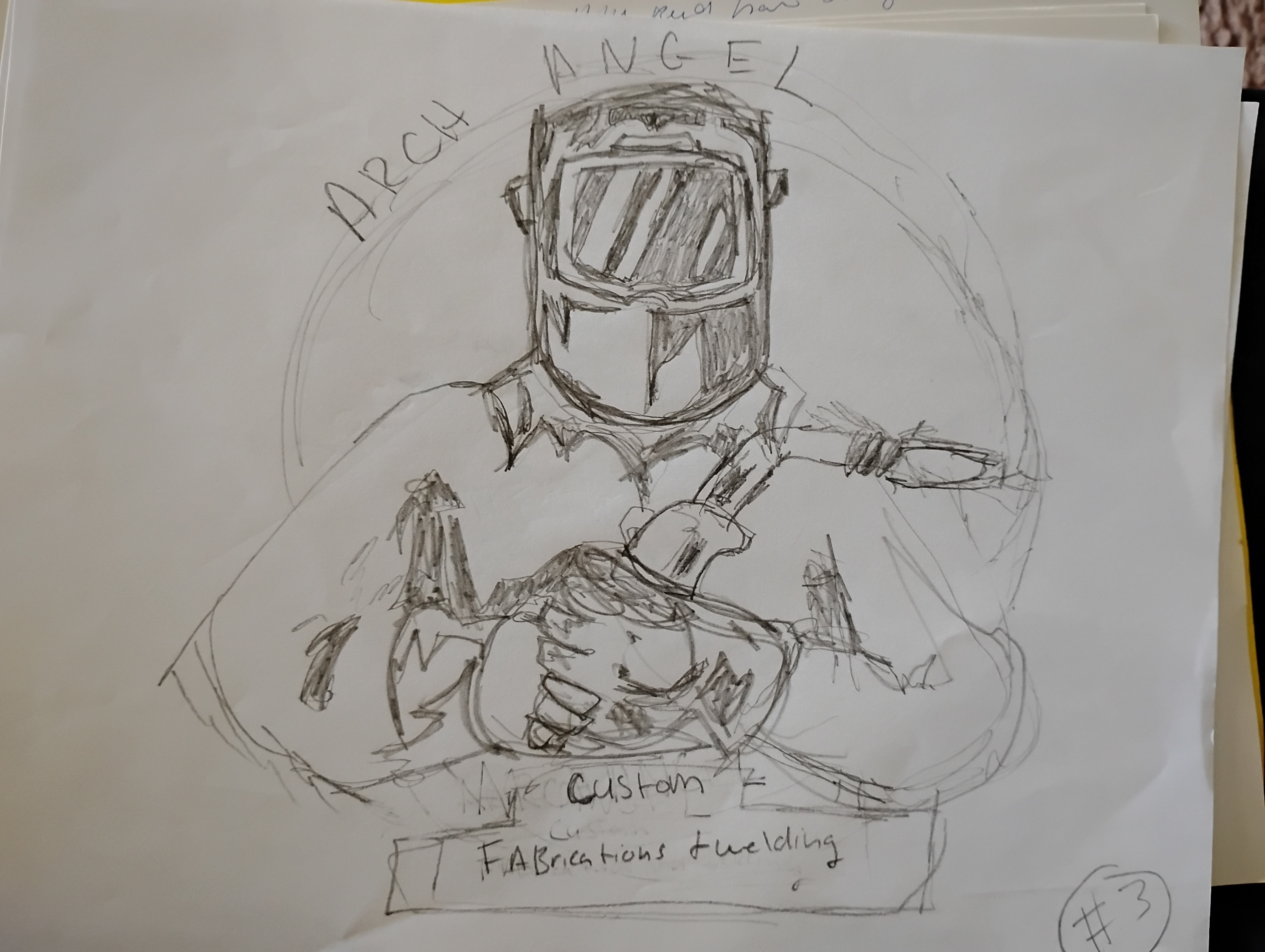
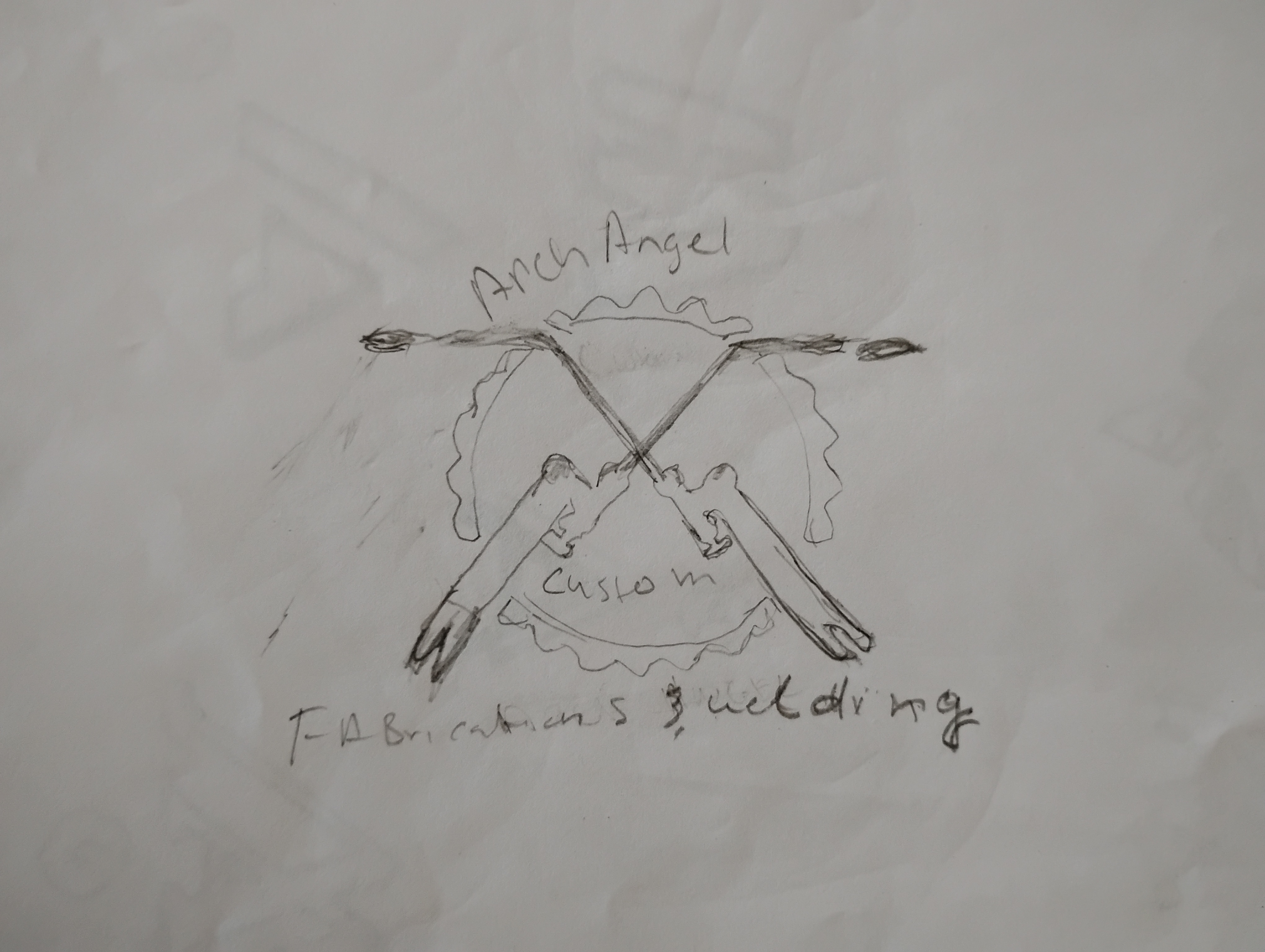
To address this need, I engaged in a comprehensive design process that began with understanding the client’s vision and values. After thorough discussions, I proposed a logo concept that integrates symbolic elements reflecting strength and craftsmanship. The color palette was carefully selected, A bold, futuristic logo that embodies Archangel's forward-thinking spirit and welding expertise. The solution features a stylized combination logo of a man welding, representing the strong reliable presence of Archangel. The custom typography, with its clean lines and geometric shapes, adds to the logo's modern appeal. The color palette boasts a striking combination of deep blue and bright orange, conveying a sense of trust, innovation, and energy featuring vibrant oranges and yellows to signify warmth and approachability, complemented by sturdy greys and blues to evoke professionalism and dependability.
The design features bold typography paired with an emblematic graphic representing welding tools, creating an immediate association with the industry while reinforcing the brand's commitment to quality. This combination not only enhances visual appeal but also fosters an emotional connection with the target audience.
Results:
The final logo successfully embodies the business’s core values, instilling confidence in potential customers. Upon unveiling the new identity, feedback from stakeholders highlighted increased interest in their services due to enhanced brand visibility. The logo has become a cornerstone of their marketing materials, contributing to a cohesive brand image across various platforms. As a result of this project, the welding business has positioned itself as a trustworthy player in its market segment, ready to forge lasting relationships with clients based on loyalty and reliability.
Reflection:
For Archangel , this logo design has been a pivotal step in elevating their brand and setting them apart in a competitive industry. By effectively capturing the company's innovative essence, the logo has positioned them for continued growth and success.
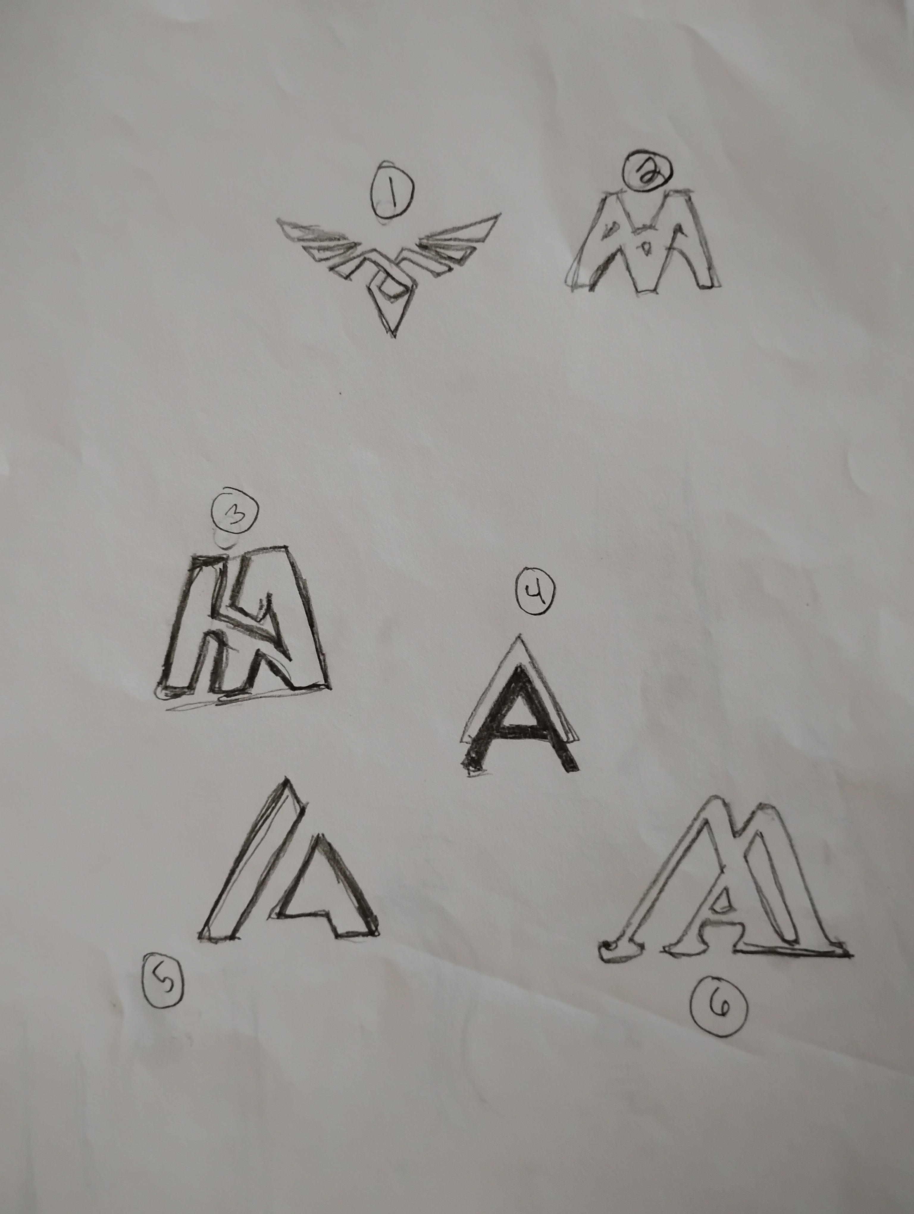
The Design Process: from start to finish
1.Discovery & Research:
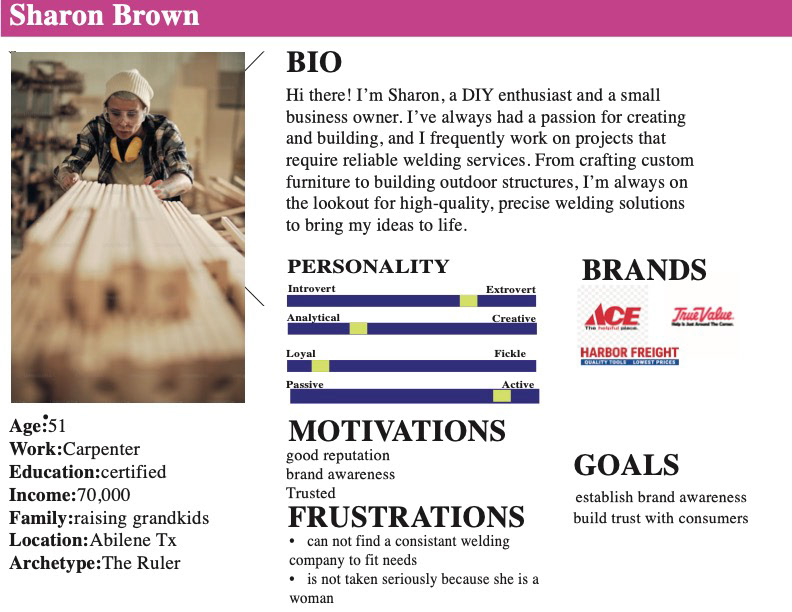
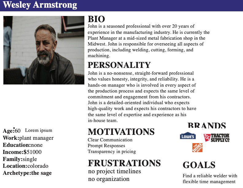
User Persona
User Persona
2. Planning and brainstorming:
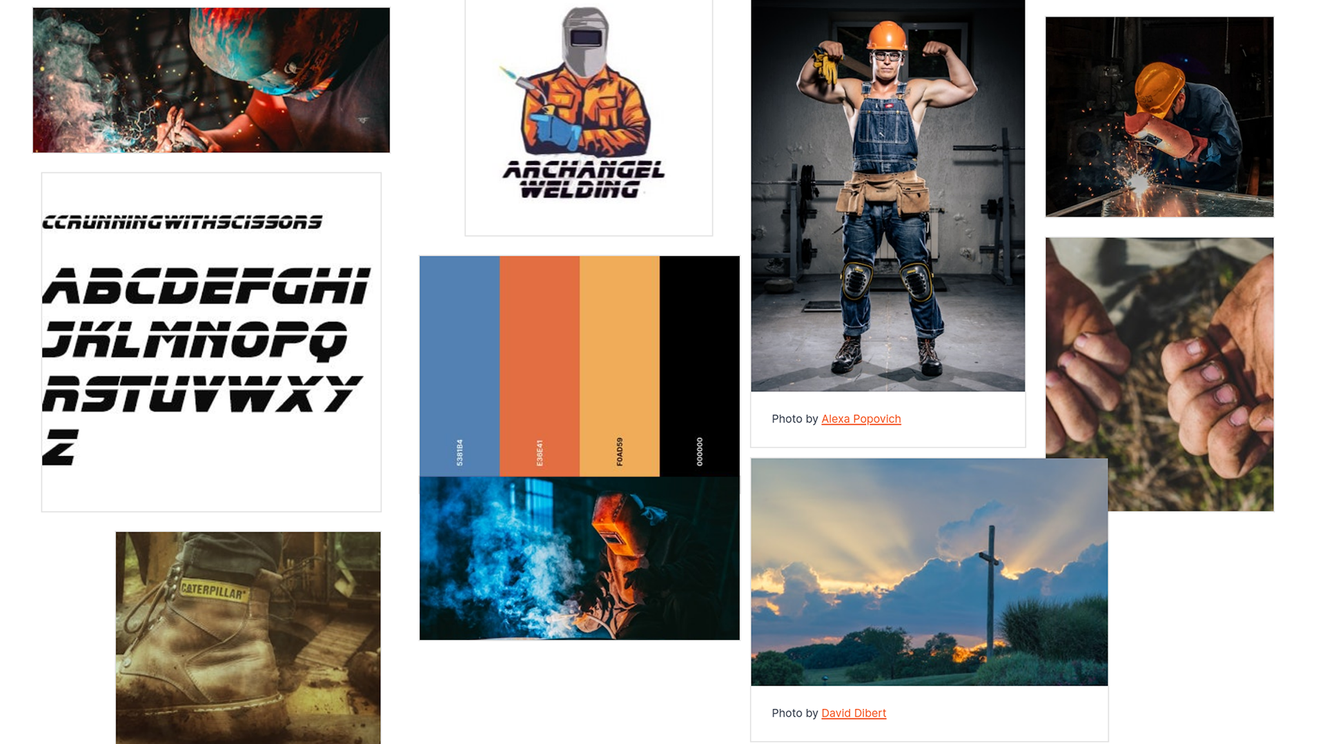
Archangel Mood board
3.Design & Refinement
4.Finalization & Delivery